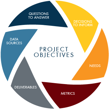
Communicate the Results
The final stage of analyzing justice system data involves preparing the results in ways that stakeholders can easily consume, respond to, and act on. Projects may include the preparation of one or more written reports, presentations/town halls, and dashboards. Regardless of the format, we rely heavily on data visualization and contextual narratives to share results.
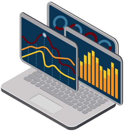
Data visualizations are graphical representations of information and data such as charts, graphs, and maps. Visualizations can more easily and simply identify trends, outliers, and patterns in data. Properly constructed data visualizations make the data more accessible, understandable, and usable to a variety of audiences. Our team has extensive knowledge and experience using a variety of visualization tools and libraries including Tableau, Microsoft Power BI, Python libraries (NumPy, Pandas, Plotly, Seaborn, SciPy), R libraries (ggplot2), and D3.js.
In addition to communicating and visualizing the data analysis results, we leverage the measures generated from the data analysis process to feed internal and external (public facing) strategic, operational, and analytical dashboards. These dashboards illuminate actionable insights and empower communities, justice system actors, policymakers, and administrators to make strategic, data driven decisions.